Media Association of Pittsburgh
BRANDING | GRAPHIC DESIGN | WEB DESIGN | MARKETING COLLATERAL
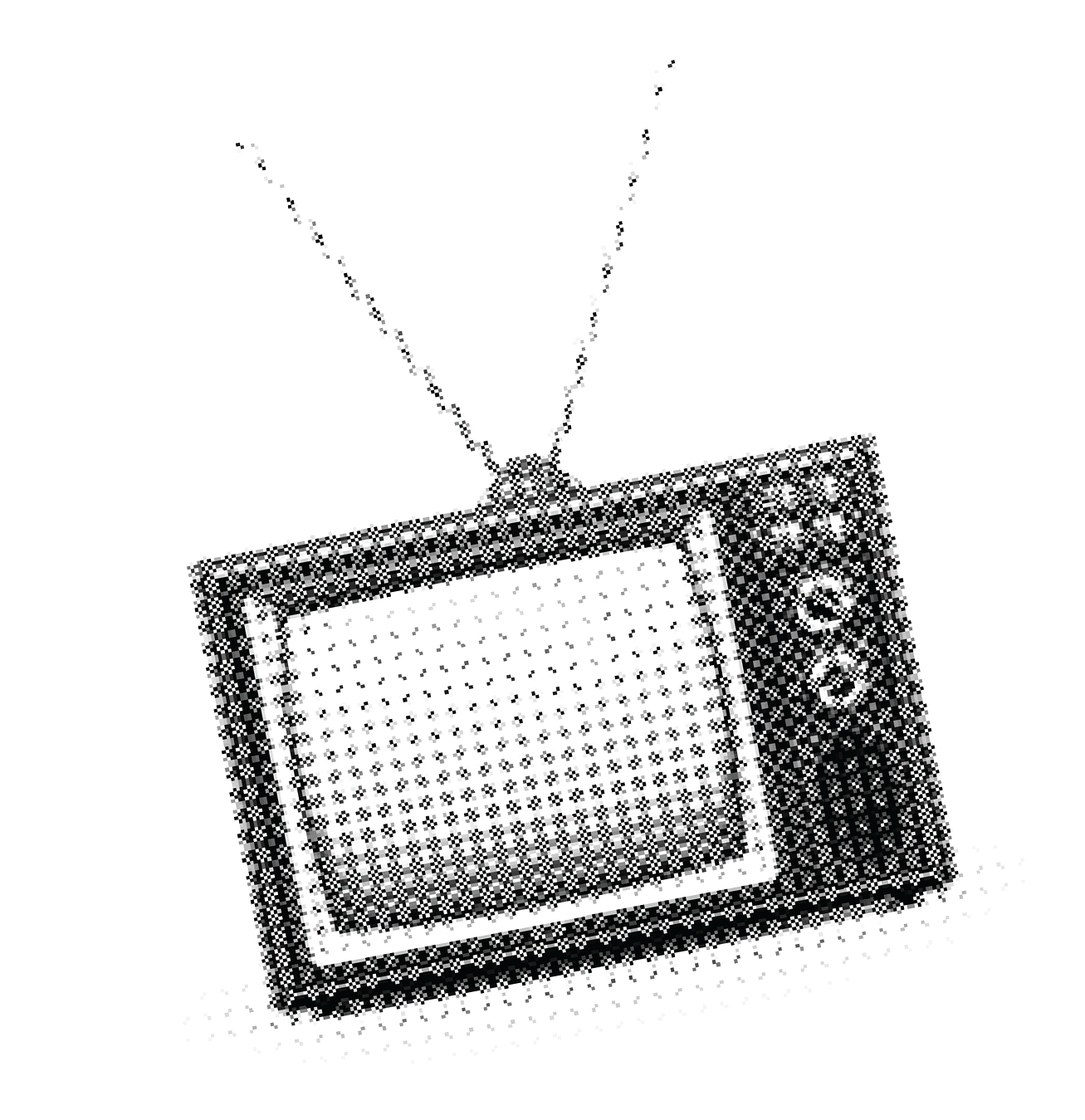
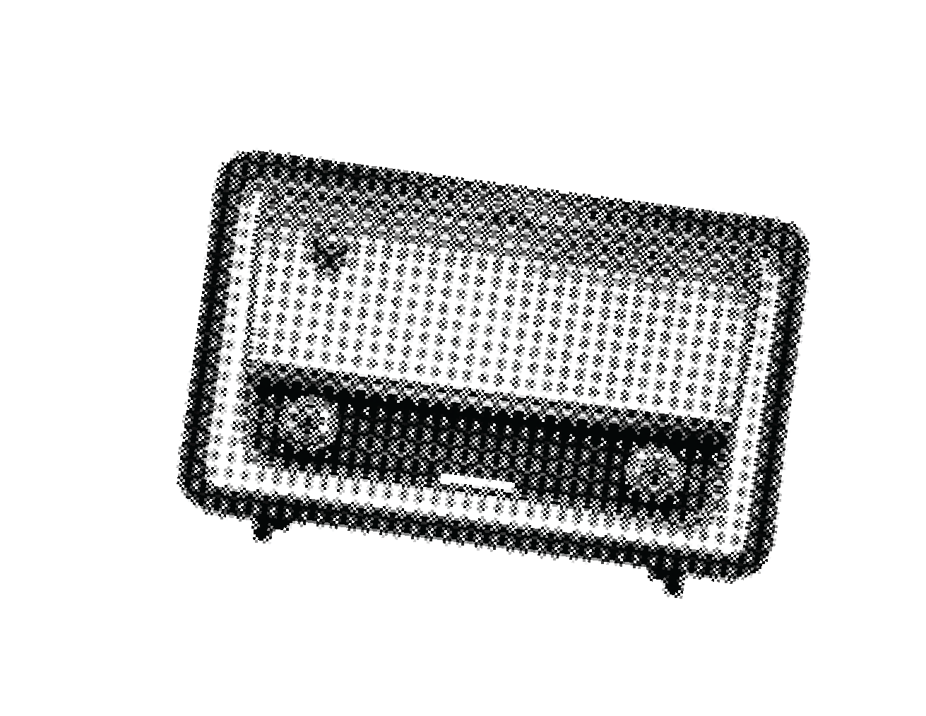
From its roots in television and radio, the term ‘media’ has grown to new heights that did not exist 20 years ago.
New job titles, positions and entire departments have been created in the past decade and the Media Association of Pittsburgh needed a fresh face to stand out in an evolving media world.
As leaders of media buying in the Pittsburgh region, MAP wanted to develop new brand assets that proclaim the expertise and inclusiveness of this dynamic industry while simultaneously respecting its historic roots and building on the current assets of the organization.

THE DRIP PROCESS
I use the term DRIP when creating a new identity: Discovery, Recommendations, Implementation, Post (Feedback/Additional Assets).
Below is a walkthrough of some of the assets that came out of the creative process with MAP stakeholders.
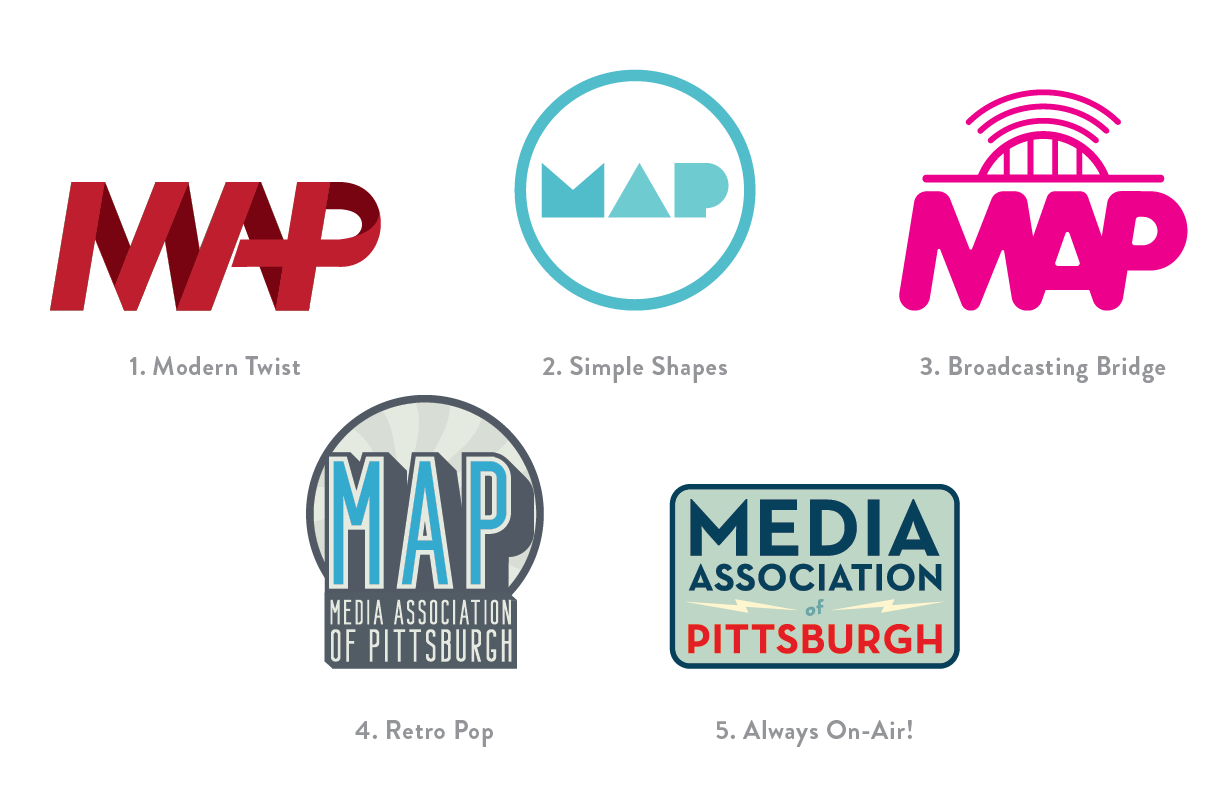
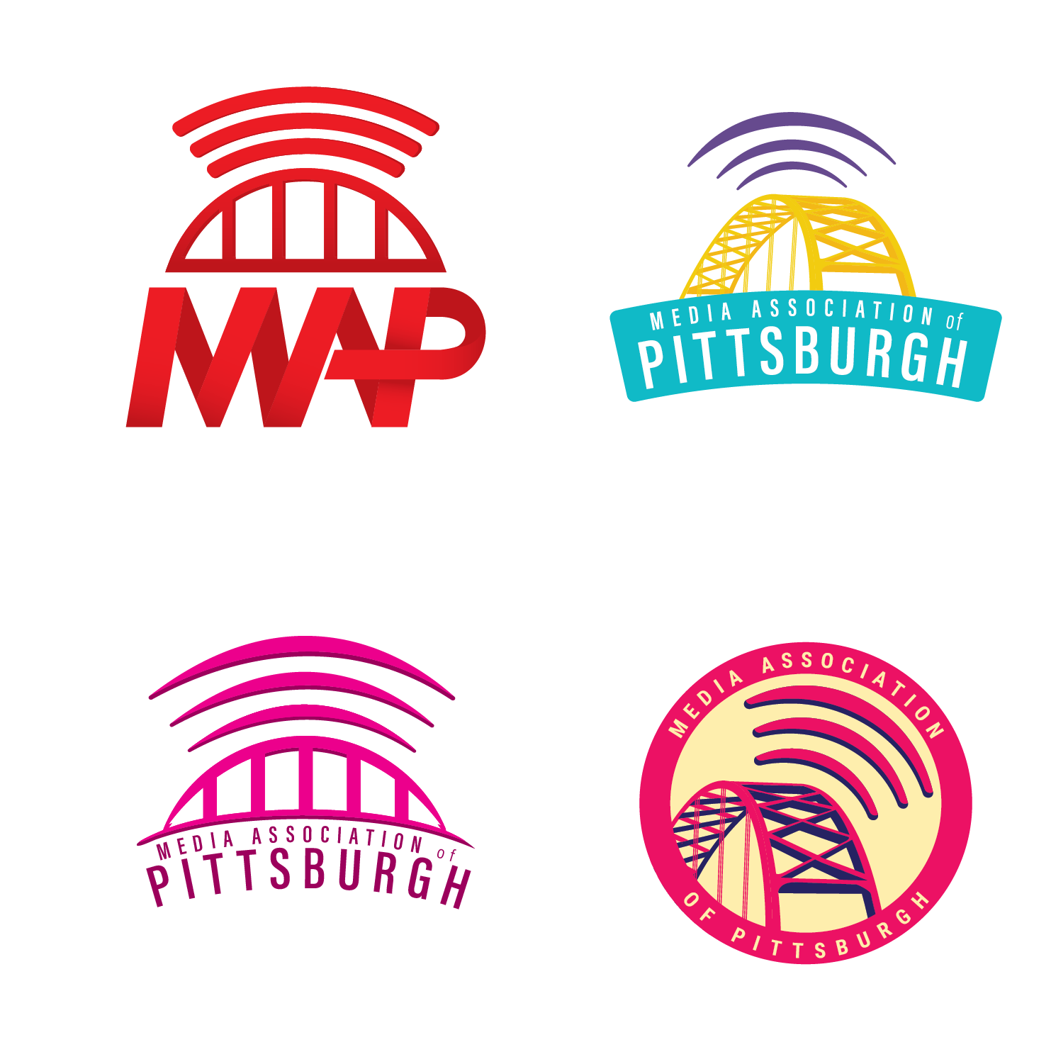
INITIAL CONCEPTS
After a discovery session with the Brand Team, I came up with 5 different directions for a new brand. My intent was to give unique directions to spur more ideas and creativity.

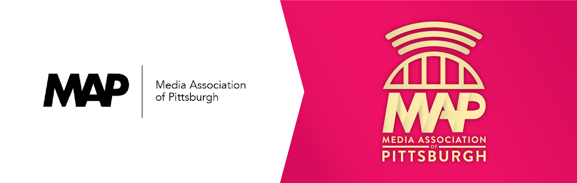
Logo RevisionS AFTER FEEDBACK
With a focus on the broadcasting bridge. I came up with a few variations in style and color. Here is where we really started focusing on the color scheme that ultimately came out in the final product.
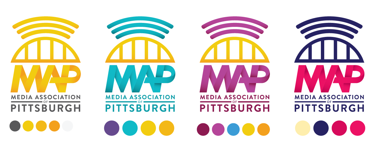
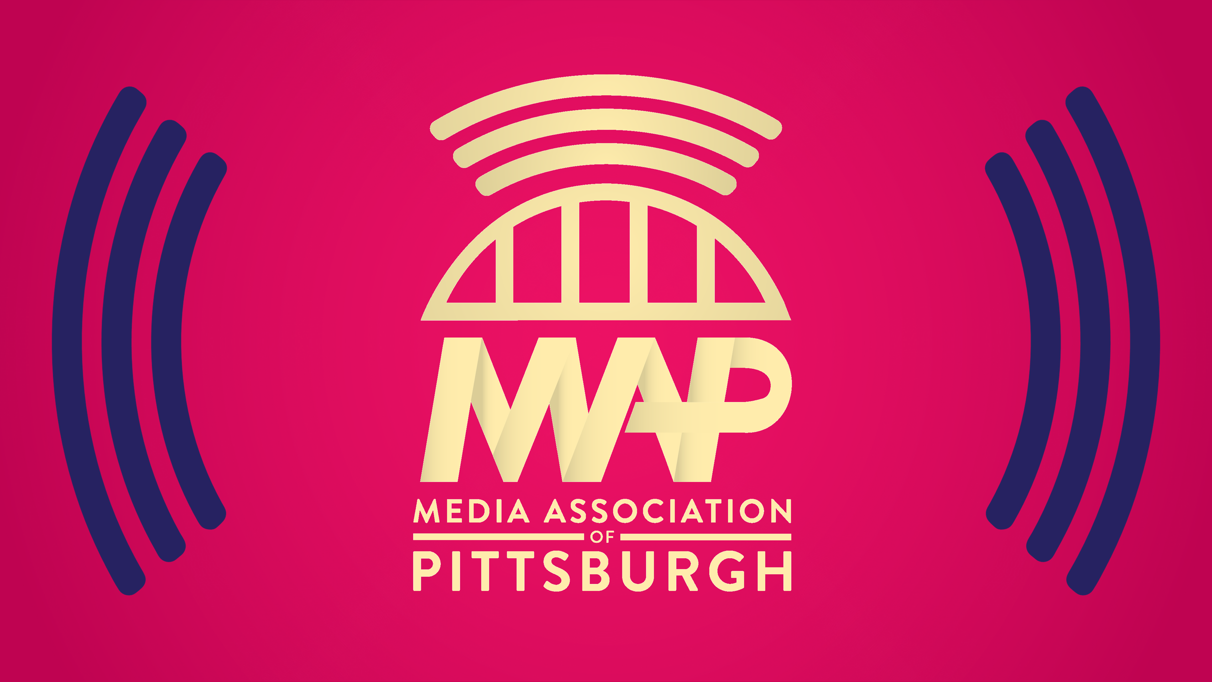
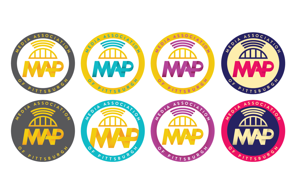
COLOR EXPLORATION
After the form of the identity was coming into shape, we started to focus on color. ‘Black & Gold’ colors was a given but what about teal/purple or other colors that worked well with a ‘Pittsburgh’ gold bridge?
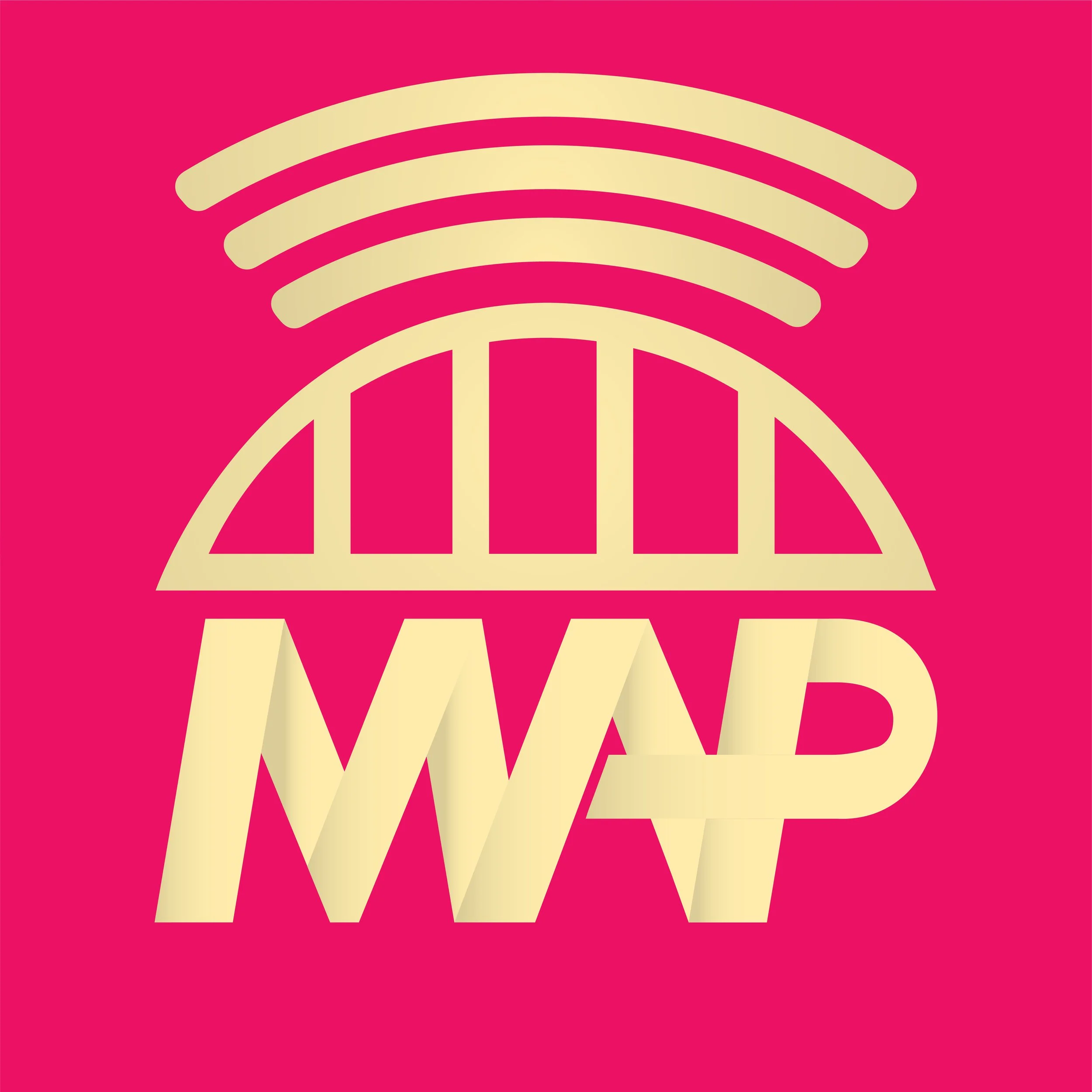
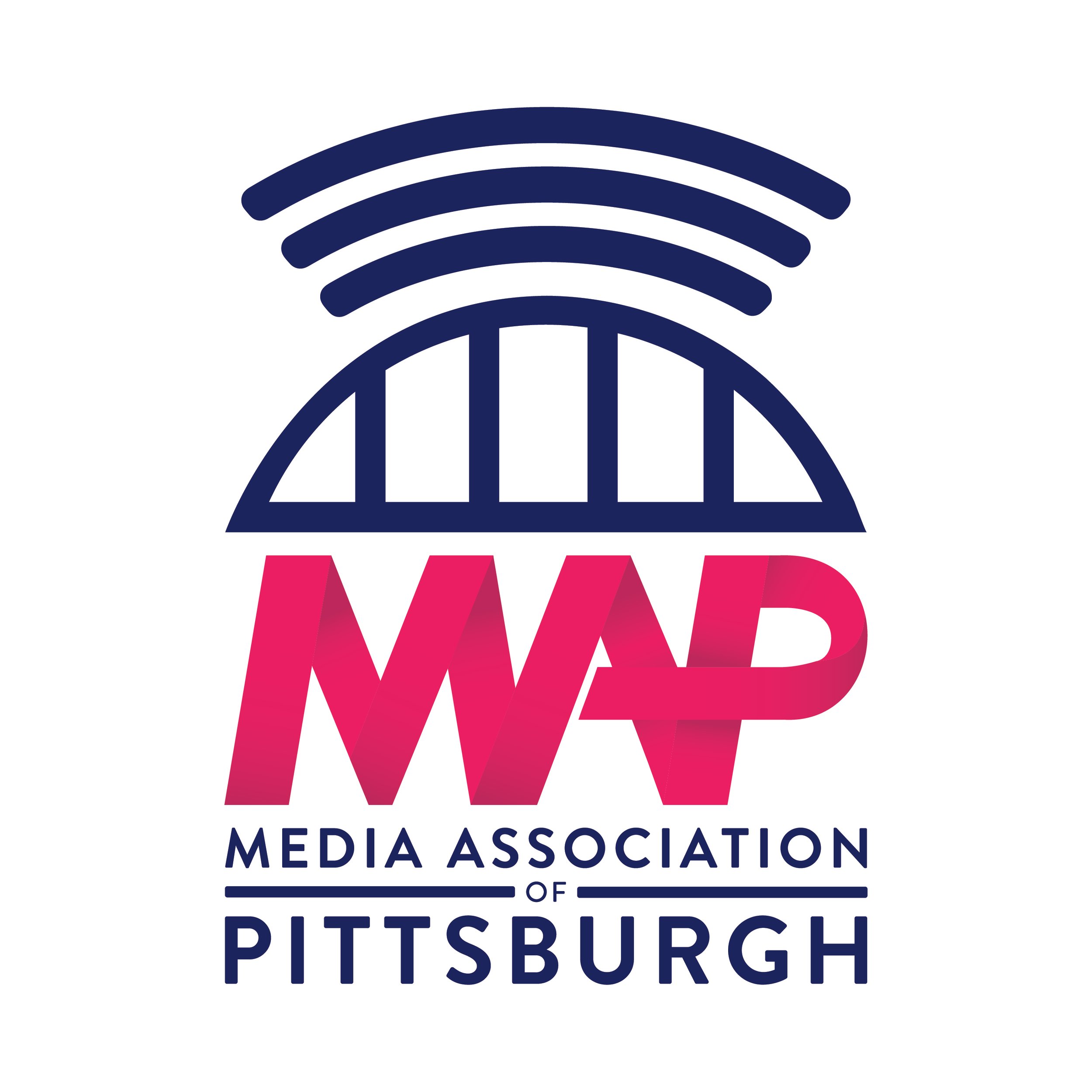
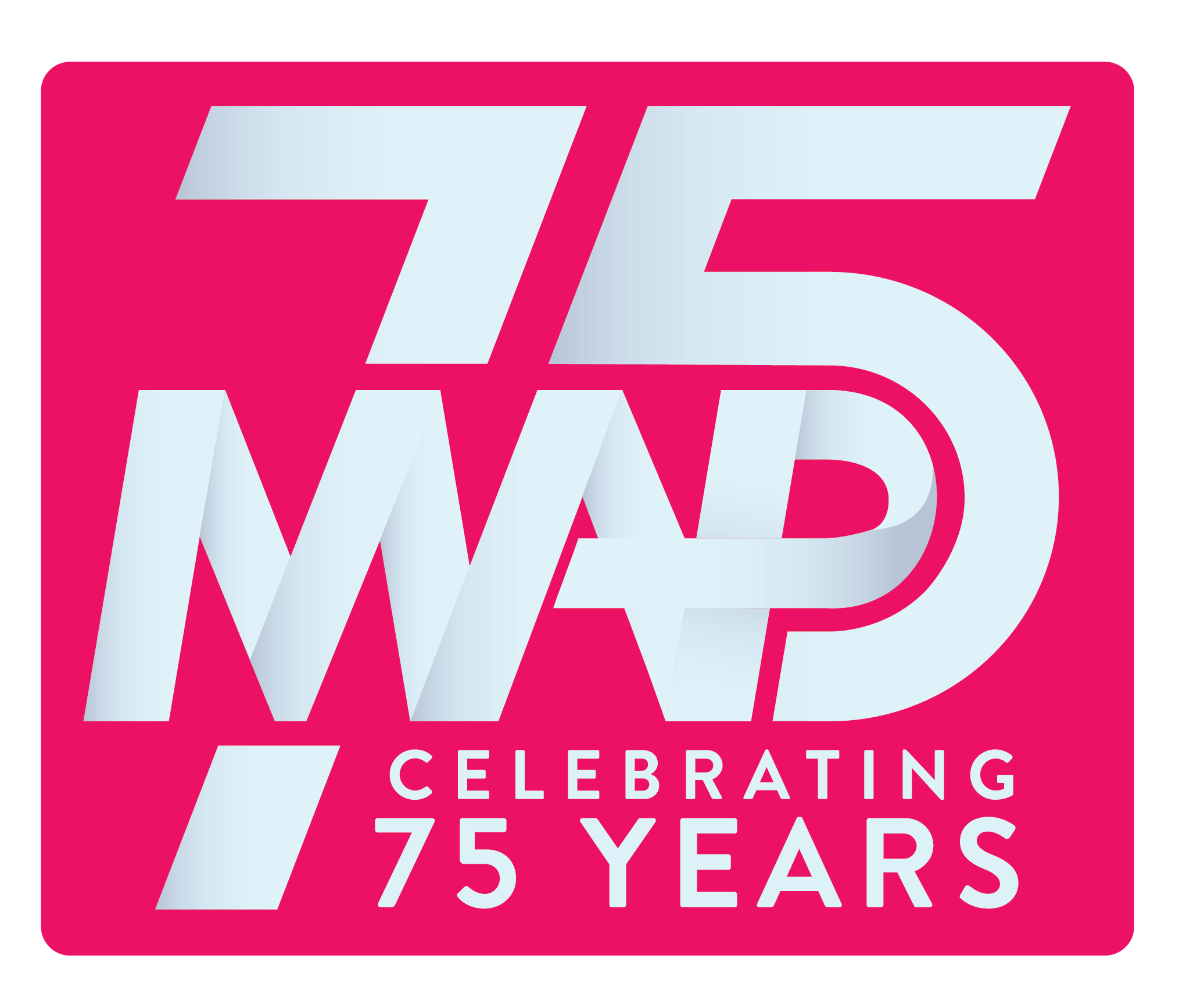
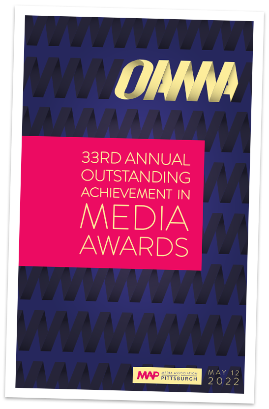
FINAL RESULTS
Overall, we achieved the goal of breathing fresh life into the MAP identity while still paying homage to the broadcasting roots.